Posts Tagged ‘web’

5 Reasons Why Your Business Needs A Website

Wednesday, September 21st, 2011

You are aware of the fact that if you want to increase the popularity of your brand, you need to promote it through the social media like Facebook, Twitter, etc. But there is one thing for sure – no matter how many business pages you have on social media, all of them combined cannot compare to the effect of a website.

According to a recent research, branded social networking pages get only 22% of customer visits, compared to the 62% of people who regularly visit branded websites. So, if your site is out of date, we strongly recommend that you think of a refresh. After reading this article you will agree with me that websites do still matter. (more…)

FREE BANNERS AND BADGES FOR YOUR WEBSITE

Monday, September 27th, 2010

FREE BANNERS AND BADGES FOR YOUR WEBSITE

Web Design and Development London

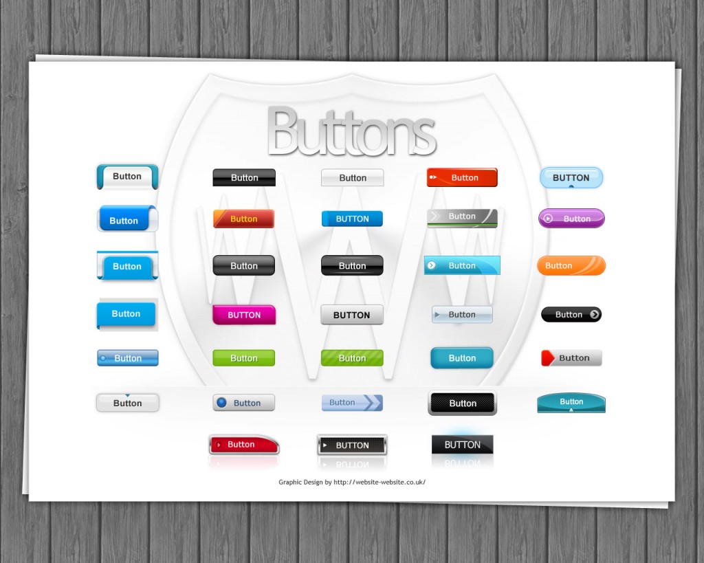
FREE SET OF SHINY BUTTONS FOR YOUR DESIGN

Monday, August 9th, 2010


Set of free shiny buttons for your design

Download the set of free stylish buttons for your design in .psd format

Web Design and Development Company

A BIT OF FRIDAY TYPOGRAPHY

Friday, August 6th, 2010

Typography is a part of the design, especially for web design it is extremely important. It is the technique of presenting the text as a state of art. To reach the result of a good typography you need to spend many hours analyzing the way people read.

Typography comes from the Greek words τύπος typos “mark, figure” and γράφω grapho “I write”.

I suppose it would not be a surprise if I tell you that people are not reading each word in the text, people are just scanning the “form” of the word. That is why text which is ALL CAPS is harder to read that the standard way, however ALL CAPS means “attention” and “important” to people, so you can use it for headings and short sentences, but it is not a good idea to use it for text.

Another thing that I would like to mention to prove the theory of reading as scanning is that if you cut a word through the middle and give the bottom part to one person and the top part to another, the one that has the top will read it easier for sure. That just the way people’s head work.

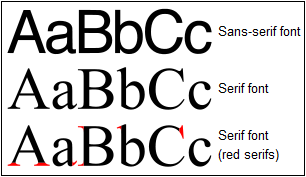
There are two main font type that are used and they are called Serifs and Sans-Serifs. What is the difference? See the image below.

The difference between Serif and Sans Serif fonts (more…)

WEB VS PRINT DESIGN: 10 MAJOR DIFFERENCES

Tuesday, August 3rd, 2010
The design of media for printing is much more different than designing internet solution media.
To get more familiar with these two types of design we would compare their features below:

The design of media for printing is much more different than designing internet solution media.To get more familiar with these two types of design we would compare their features below:

1. Size & Resolution

WEB
The size of the images is 1:1, with resolution 72 dpi (dots per inch)

PRINT
The size of the images is 1:1, with resolution 300 dpi (dots per inch)

2. Colors

WEB
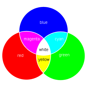
All colors are in RGB (Red, Green и Blue) mode.
Design for web

(more…)

IS MY WEBSITE GOOD ENOUGH?

Tuesday, July 20th, 2010

Most of you may already have websites or personal blogs, however you may wonder why the website is not successful, why there are just a few unique visitors?

In depends on lots of factors such as code, design, optimization, page load time, backlinks, usability, accessibility, valid code etc.

Free tool which generates a health check report of your website?

Have you ever asked yourself  Is my website good enough?

Web Design and Development Company

INTERNET MARKETING FLOURISHES IN BAD ECONOMY

Tuesday, July 20th, 2010

Today`s hard economic times will force small businesses to find a smarter way of promoting their products and services. One of these ways is by getting a Web site.

The statistics says that by the end of 2010 more than 60% of the small and midsize businesses will get their own web sites compared to only 33% in 2008, according to the Princeton, N.J., local search and directory research firm- Home_RepairmanKelsey Group.

Matt Booth(Kelsey Senior Vice President) said: (more…)

HOW TO CHOOSE THE RIGHT COLOR SCHEME

Tuesday, July 20th, 2010

Whenever starting design for a website you need to think about you colour scheme. How would you mix and compose the colours and pictures, so that it will attract public attention. This is not as easy as it may look like. To start with, you may use the computer basic colour scheme, or if your website has a logo, you may choose a scheme that suits its colours. If you have already designed a page header or title, you may be eager to select a colour that is already present in the design. Doing this, you’ll be able to make a sensible and aesthetic mixture of colours and colour schemes.

These days many people prefer to use a scheme selector for their website’s design, because it is time saving and gives you the ideas you need. If you want to use this selector, first of all, you need a basic colour. Take for instance the following situation: You have a green logo and you think that a greenish website will fit in well in presenting your company. Then the selector will give you the chance to choose complementary, analogic, monochromatic or contrasting amongst the others colours. (more…)

WHAT YOU NEED TO HAVE A SUCCESSFUL WEBSITE

Tuesday, July 20th, 2010

When you start creating a website you should think about “What do I need to have a successful website?”

Imagine that – you already have your website and everything is working properly, the design is fancy and you are happy that your business is already online. But something is wrong. You do not have the expected traffic, people are not buying or contacting your office. This is the time when you start asking yourself “What’s wrong with my website.” and “What important part I’ve missed?”

In fact, there a many thing that you should think about.

Design and UX

Your design should be up to date. People do not like old looking websites. You should ask the developers to add some of these new things that the users like and make the user experience better. It is not only the right color scheme or style, it is also the interaction.

Importance: 6/10 (more…)

ONLINE MARKETING AND COLOR PSYCHOLOGY

Tuesday, July 20th, 2010

Internet is an ubiquitous place. We can use it for communication, for finding information and even for marketing. Internet marketing is much more different from the ordinary marketing. In this type, there is no face-to-face contact, so we cannot rely on our charm and ability to convince people, but to a little bit different ways of presenting products. We need to use different psychological tricks and knowledge, so that it becomes our most powerful weapon in the fight for clients.

One of the most important psychological aspects that should be considered when doing on line marketing is colour influence over people. In real marketing we use words to present our products, in on line marketing our word are the colours, as each colour expresses its own “message” to the clients. (more…)