 Make sure you have clear directions on the navigation of your website. The navigation menu should be uncluttered and concise so that visitors know how to navigate around your website without confusion.
Archive for the ‘Design’ Category
Good Design Practices
Thursday, September 1st, 2011 Make sure you have clear directions on the navigation of your website. The navigation menu should be uncluttered and concise so that visitors know how to navigate around your website without confusion.
5 Important Rules in Website Design
Tuesday, August 23rd, 20111) Do not use splash pages
WEB DESIGN ELEMENTS YOU SHOULD AVOID
Friday, February 18th, 2011As a web designer, you should design your websites to give your visitors the greatest ease of use, the best impression and most important of all a welcoming experience. It doesn’t matter if you had the greatest product in the whole world — if your website is poorly done you won’t be able to sell even one copy of it because visitors will be driven off your website by the lousy design.
When I’m talking about a “good design”, I’m not only talking about a good graphical design. A professional web designer will be able to point out that there are many components which contribute to a good website design — accessibility design, interface or layout design, user experience design and of course the most straightforward, which is graphic design.
Hence, I have highlighted some features of the worst web designs I’ve come across. Hopefully, you will be able to compare that against your own site as a checklist and if anything on your site fits the criteria, you should know it’s high time to take serious action!
(more…)
A BIT OF FRIDAY TYPOGRAPHY
Friday, August 6th, 2010Typography is a part of the design, especially for web design it is extremely important. It is the technique of presenting the text as a state of art. To reach the result of a good typography you need to spend many hours analyzing the way people read.
Typography comes from the Greek words τύπος typos “mark, figure” and γράφω grapho “I write”.
I suppose it would not be a surprise if I tell you that people are not reading each word in the text, people are just scanning the “form” of the word. That is why text which is ALL CAPS is harder to read that the standard way, however ALL CAPS means “attention” and “important” to people, so you can use it for headings and short sentences, but it is not a good idea to use it for text.
Another thing that I would like to mention to prove the theory of reading as scanning is that if you cut a word through the middle and give the bottom part to one person and the top part to another, the one that has the top will read it easier for sure. That just the way people’s head work.
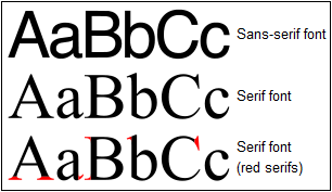
There are two main font type that are used and they are called Serifs and Sans-Serifs. What is the difference? See the image below.
10 WEBSITES WITH FANTASTIC BACKGROUNDS
Thursday, August 5th, 2010WEB VS PRINT DESIGN: 10 MAJOR DIFFERENCES
Tuesday, August 3rd, 2010The design of media for printing is much more different than designing internet solution media.To get more familiar with these two types of design we would compare their features below:
1. Size & Resolution
WEB
The size of the images is 1:1, with resolution 72 dpi (dots per inch)
PRINT
The size of the images is 1:1, with resolution 300 dpi (dots per inch)
2. Colors
WEB
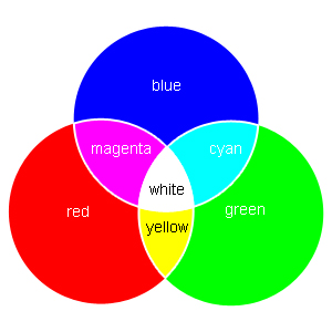
All colors are in RGB (Red, Green и Blue) mode.
CREATE YOUR WEBSITE FOR THE PEOPLE, NOT FOR YOURSELF
Tuesday, July 20th, 2010Anytime you start creating a website, no matter if you are web developer, or broker or even a shopkeeper you should think how to build the website for your visitors – not just for you.
The website may become a powerful marketing tool with tons of benefits for your business and you really need to build it for the people. If you have participated in the creation of a website you may know that the following situations happen in practice:-
- But I don’t like to color these guys are using for my website?
It doesn’t matter if you do not like the color. Think about what color will like your target group.
- I don’t want to provide much information about me and my company. I feel insecure.
Your visitors want to know who you are. If they are well informed, they will feel more comfortable to contact you and believe me, most of them will goggle your company name for feedbacks from your clients on the web, so keep your customers well informed and happy. (more…)
LOGO DESIGN
Tuesday, July 20th, 2010Logo design is an interesting topic and we receive many questions about it. The website logo is a very important element for a website. It needs to be memorable, because this would be the trademark, and the company’s face, so that the customers would associate it with your business. It should be simple- the more complicated and full of elements, the less effect on customer. Take for instance some of the world`s most famous brands like McDonalds, Coca Cola , KFC or Milka. They are so clean and simple, that if you see it ones, you remember it effortlessly and even unconsciously. Of the logo is composed of many elements, colours and words, the clients just cannot remember it properly , consequently they cannot remember the company. In addition the logo must be easy recognisable from a distance. Just a word or sign must imply much more than thousands of words (more…)


