Typography is a part of the design, especially for web design it is extremely important. It is the technique of presenting the text as a state of art. To reach the result of a good typography you need to spend many hours analyzing the way people read.
Typography comes from the Greek words τύπος typos “mark, figure” and γράφω grapho “I write”.
I suppose it would not be a surprise if I tell you that people are not reading each word in the text, people are just scanning the “form” of the word. That is why text which is ALL CAPS is harder to read that the standard way, however ALL CAPS means “attention” and “important” to people, so you can use it for headings and short sentences, but it is not a good idea to use it for text.
Another thing that I would like to mention to prove the theory of reading as scanning is that if you cut a word through the middle and give the bottom part to one person and the top part to another, the one that has the top will read it easier for sure. That just the way people’s head work.
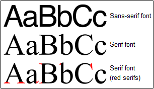
There are two main font type that are used and they are called Serifs and Sans-Serifs. What is the difference? See the image below.


